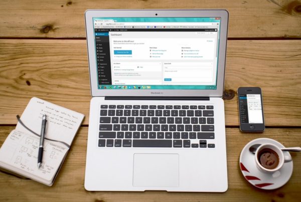
Are you a small business owner? It’s likely you’ve considered having some sort of web presence, and you probably already do. But if you want to elevate your business to the next level, a real website grants a sense of legitimacy.
Before you dive into design, know this: as of 2017, 48.2% of all web traffic was from mobile devices. Your site needs to look great on mobile! For a DIYer, there are a few things you need to know when crafting your mobile site.
Think Small
Your desktop site can take advantage of all kinds of new web features: parallax scrolling, moving backgrounds, embedded video. Unfortunately, those elements come at a price: size. Not literal size, mind you, but data size. For the uninitiated, all data that appears on your computer screen takes up digital storage space. For mobile, that’s usually expressed in megabytes.
When designing your mobile site, crank down the visual amenities in favor of keeping things streamlined. Many consumers still use older mobile devices, and small sites load faster and are easier to use for them.
Think Vertically
Desktop computer monitors are wide; mobile devices are tall. As a result, you need to design your site with a new form factor in mind. Put your most important information at the top: links to your menu, store hours, how to contact you.
Most mobile sites use something called a “hamburger menu.” It sounds silly, but you’ve almost certainly seen it: three horizontal bars, typically on the left or right side of a page. The hamburger menu easily consolidates non-essential information in a place viewers can turn on or off at will. It’s a great way to save space.
Think With Touch
Mouse pointers are small. Fingers come in all manner of sizes, as do touch screens. As a result, you need to design your mobile site around accessibility. Buttons should be larger in size, links should be large enough to click without the tip of a fingernail.
Another thing to keep in mind: if you have PDF menus or brochures for your desktop site, consider redesigning them for mobile. No one likes having to constantly zoom in and out just to get the information they need.
If you need help designing your businesses’ website – contact Final Piece today!